JR Technika – The Comfort of Perfect Temperature
Project timeline
2024 – Present
 JR technika – logo, basic version
About the client
JR Plynoservis s.r.o. is a gas appliance service company with a long history in Prostějov and the surrounding region. The company was founded by Jan Roháček shortly after the Velvet Revolution, and over the decades it has grown into one of the most experienced and reliable businesses of its kind in the area. Today it is run by the founder's grandson, Martin Hudeček, and the team of five service technicians handles approximately 800 customers every month. That number alone says a lot.
The brief
The company came with a clear need: the old name and visual identity no longer reflected where the business was actually heading. Management knew they wanted to expand beyond gas appliances, adding heat pumps, electric boilers, and eventually perhaps air conditioning. But the name "JR Plynoservis" simply couldn't carry that kind of scope.
On top of that, the company had been operating for years without any real marketing presence or a website that matched the actual quality of their work and facilities. And yet they had plenty to offer. On the market, however, they were being overshadowed by competitors who invested more in presentation, but considerably less in craftsmanship.
The first step was finding a new name. Based on a thorough review of available domains and the business register, I proposed several options. The ideal solution turned out to be a combination that is short, easy to remember, and accurately captures what the company does, without limiting them in any way going forward – jrtechnika.cz. The initials JR are preserved as a historical nod to the founder, while the word "technika" (technology / engineering) covers installation, servicing and future expansions without ever needing to change.
Alongside the naming research, I began working on a new logo and tagline. The original "Your guarantee of warmth" was refined into The Comfort of Perfect Temperature, because it better encompasses cooling and heat pumps as well. A key constraint in the logo design was preserving the JR initials, which the company insisted on for both historical and sentimental reasons, while still arriving at something that would work equally well on a business card and on a vehicle wrap or building facade.
As the foundation for the entire website, I then created a detailed project documentation defining target audiences, user personas, specific user scenarios, information architecture, and technical requirements. This document is the backbone from which everything else follows: page structure, tone of writing, and the choice of photography.
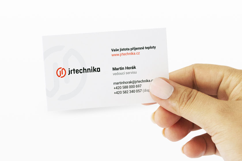 JR Technika – business cards
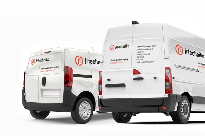 JR Technika – company vehicles concept
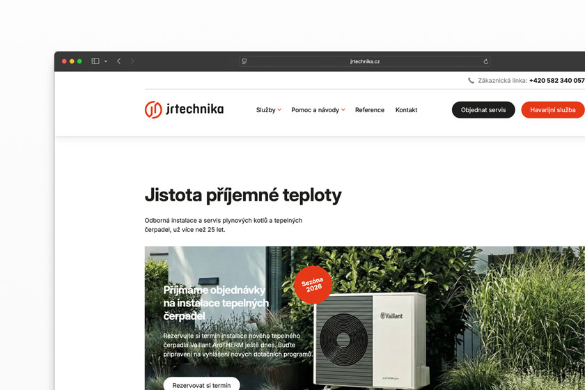 JR Technika – company website
I gradually provided
- Consultations and analysis
- Research and new name / brand proposal
- Logo and tagline
- Company website
- Copywriting
Summary
What I enjoyed most about this project was that the company genuinely had a lot to say – they just weren't saying it anywhere. Years of experience, their own parts warehouse, emergency service even over Christmas, technicians with over a decade of hands-on practice. All of that existed, but a customer searching for help in the middle of winter had no way of knowing. I hope that has now changed.