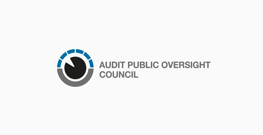
Audit public oversight council logo
Project timeline
2009
 RPVDA - logo, its basic appearence
About client
WebProgress, s.r.o. contacted me with a demand and a very brief instructions: to create an easily readable logo that would represent this newly founded state organization with dignity.
The brief
Overall, the logo resembles a human eye as a symbol of oversight and control, which are the main contents of board's work.
I composed the upper part of six segments that represent six independent members of the board. Colour blue is a symbol of trust, reliability and communication, formal black symbolizes authority and strength, grey represents neutrality and detached view.
Because the logo was supposed to be emotionally neutral, easily readable for broad public, in various sizes and on various materials, I choosed a neutral font Helvetica.
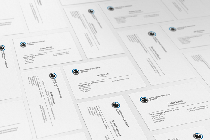 RPVDA - business cards
 RPVDA - graphic manual
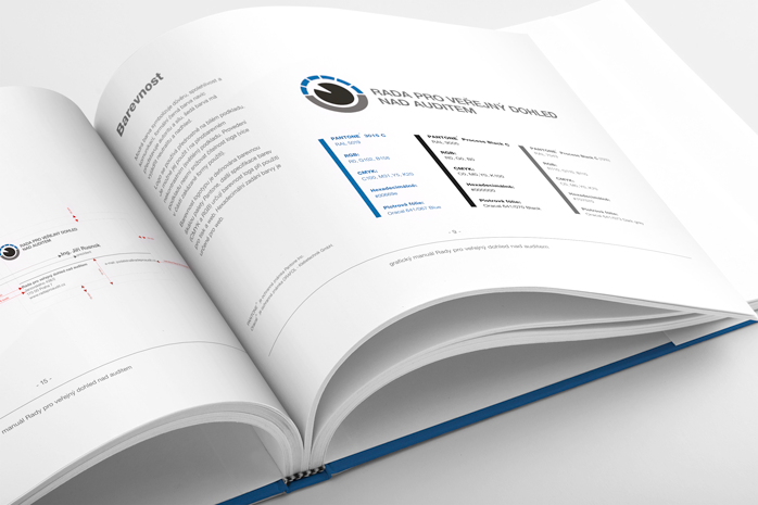 RPVDA - graphic manual
I gradually provided
- Consultation and analysis
- Logo
- Graphic manual
Summary
A sharp eye in the middle, six members of the board, neutrality, trust and watchful oversight. I think that this logo consists of all these and therefore perfectly depicts the board's purpose.