WSoptics – Next-gen Industrialization of CAD Models
Project timeline
2024
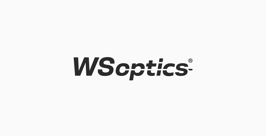 WSoptics – logo, basic version
About the client
WSoptics GmbH is a software company based in Altenstadt, Bavaria, building tools for sheet metal manufacturers that actually know what they're doing under the hood. Founded in 2011 by mathematicians and engineers, the company doesn't rely on third-party CAD libraries assembled into a presentable interface. Their flagship product WSi handles everything from unfolding and nesting to laser cutting simulation and ERP export, and does it fast. In 2022, a product demo they released became the most successful YouTube video in Trumpf's history. By 2024, they had grown to around 20 people and moved into their own building. Their client list includes names like Claas, Magna Steyr and GROB, which tells you something about the level they operate at.
The brief
WSoptics came with a redesign request for their existing logo. The core constraint was clear from the start: the "WS" part should remain upright while "optics" stays italic, because that typographic split had been a recognisable visual standard for the company for years. On top of that, the logo needed to feel precise and technical, without tipping into cold or generic territory. A horizontal cut element was to be kept as a visual reference to laser cutting, which is central to the industry they serve.
What looked like a relatively contained brief turned out to need more than just adjusting existing letterforms. No available typeface gave the right result when the two weights and styles were set side by side. The proportions were off, the optical balance wasn't there. The only way to get it right was to draw the missing parts by hand.
The final logo includes custom-drawn letterforms that don't exist in any typeface. The "WS" characters were drawn from scratch to sit correctly next to the italic "optics" and to give the whole mark the kind of precision you'd expect from a company that writes its own algorithms. That level of control wouldn't have been possible any other way, and it's also what makes the result genuinely unique rather than just a font pick.
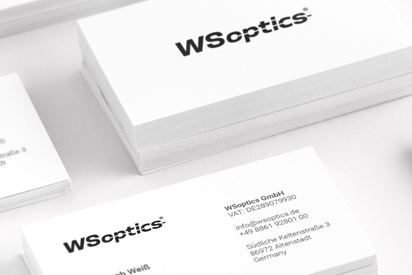 WSOptics – business cards
I gradually provided
- Consultations and analysis
- Logo redesign
- Partial custom lettering / hand-drawn letterforms
Summary
WSoptics is a company that builds tools from first principles instead of assembling them from off-the-shelf parts. It felt right that the logo should follow the same logic. When no existing typeface gave the right result, the answer was to make what was needed. The end result is a mark that fits the company precisely, because it was made specifically for them.