Lenka Smékalová – Jewellery
Project timeline
2022
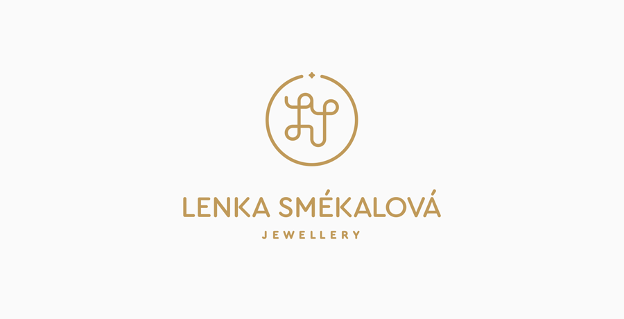
 Logo Lenka Smékalová, basic version
About client
Mrs. Lenka Smékalová is an artistic goldsmith - she crafts precious metals and makes jewellery from them. She not only creates jewellery on request, but also designs her own. In addition, she also repairs damaged jewellery and jewellery pieces, including making their missing parts.
The brief
Mrs. Smékalová needed a logo that not only represented her name with dignity, but also reflected her personal approach, attention to detail and craftsmanship.
Above all, the logo had to be subtle, feminine, original, and easily distinguishable at first glance from hallmarks or other production marks.
I constructed the logo using a geometric grid so that it resembles the initials of a name written in handwriting. The letters are placed in the center of a circle, which should symbolizes a jewel in the form of a ring or necklace. The rounded shapes of the entire monogram then reflect the delicacy and the small, almost invisible stone at the top of the monogram represents the sense and attention to detail that is so necessary in jewellery making.
I have tried to avoid the stereotypical use of serif fonts, which most people subconsciously associate with jewellery and luxury goods. By using a handwritten monogram, we were able to stand out from the crowd while remaining personal and original.
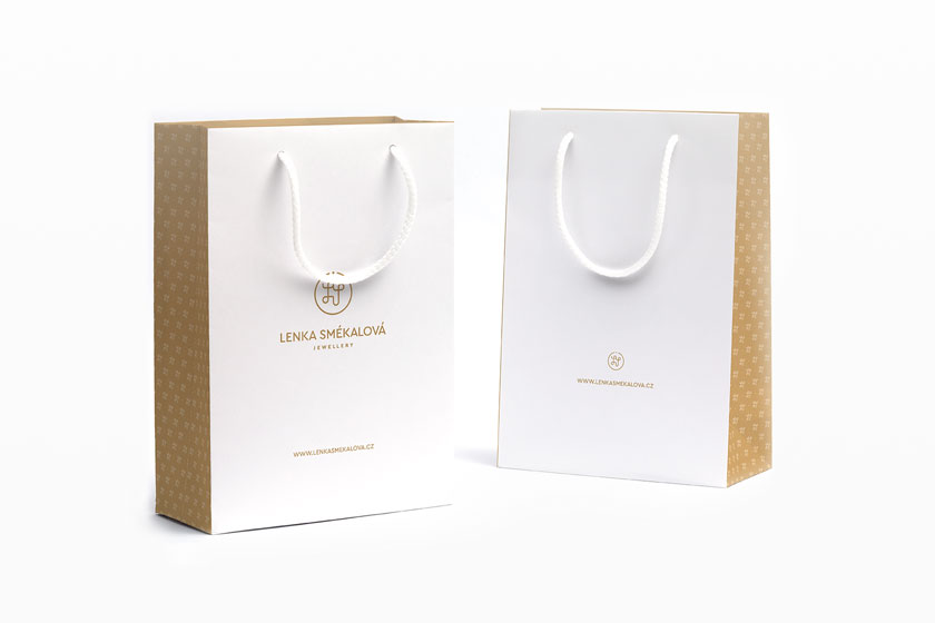
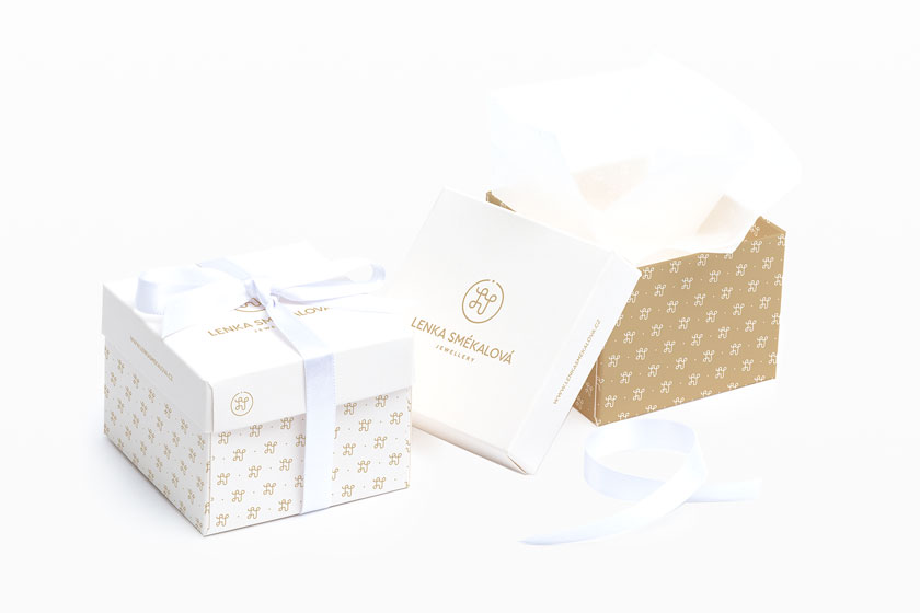
In addition to jewellery, the logo is also used on boxes, bags and other corporate items, for which I have designed simplified variations of the logo, including a pattern created purely by monogram itself.
 Lenka Smékalová – paper bags
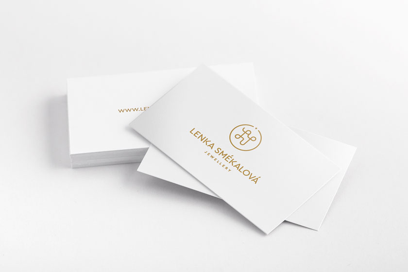
 Lenka Smékalová – business cards
 Lenka Smékalová – jewellery boxes
I gradually provided
- Consultation and analysis
- Logo
- Printed materials
- Packaging design
Summary
I believe that the logo will permanently represent the excellent work and values of Mrs. Smékalová.