D-Klima – The fresh air
Project timeline
2012 / 2013 / 2014
 D-Klima - logo, basic version
About client
D-klima is a manufacturer focusing on producing high-quality air-conditioning ducts and pipe fittings considering the materials and precision of production. The goal was to replace their existing logo with a new one that would better represent company's culture but also the essence of their products and services that are automatically associated with their products – mostly air-conditions.
The brief
My main goal with the logo was to imply the basic features of air-condition on such level that is comprehensible for end consumer. Air-condition and all the related products are associated with something else, but everybody knows thermostat on the wall, that controls the temperature.
That's why I decided to created a graphic part of the logo to symbolize a change of temperature, air movement, innovation, but also continuous technical advancement of the company.
Thanks to this concept, I managed to avoid stereotypical motives in graphics, which are usually a snowflake, the sun, a flame, the wind or a wave, often also ventilation grille.
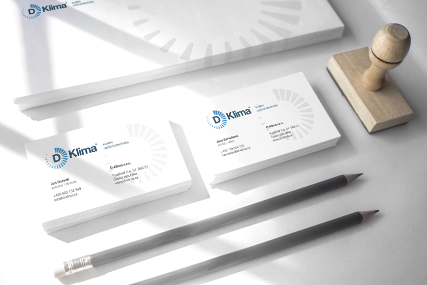 D-Klima - business cards
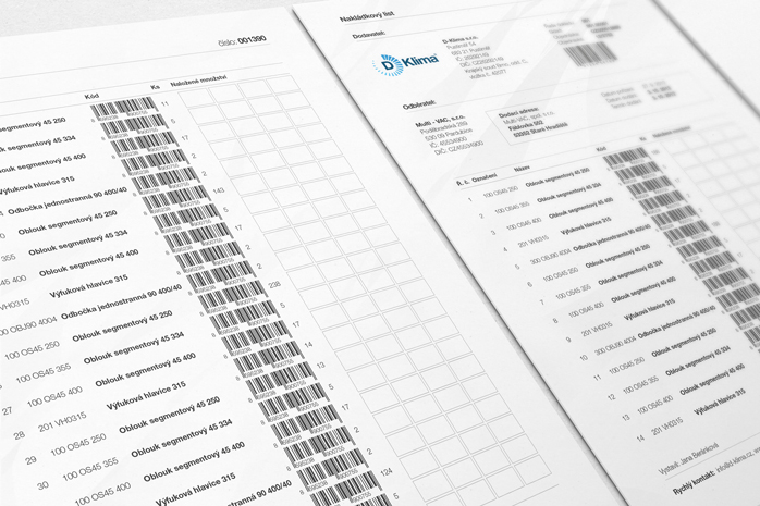 D-Klima - bill of lading
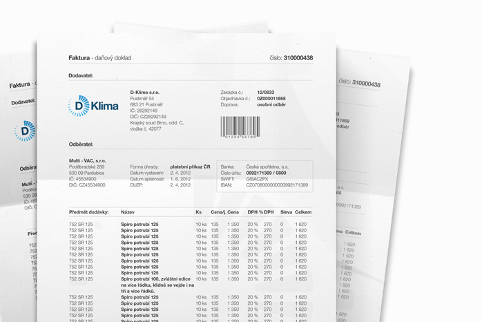 D-Klima - invoice
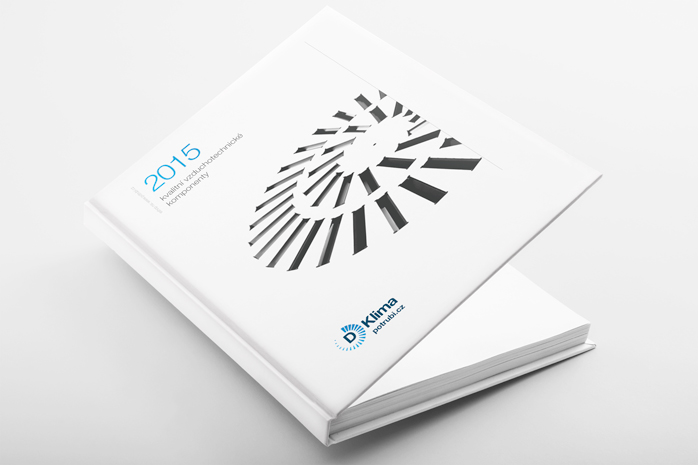 D-Klima - product catalogue
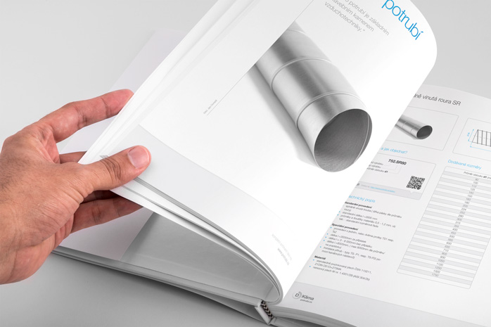 D-Klima - product catalogue
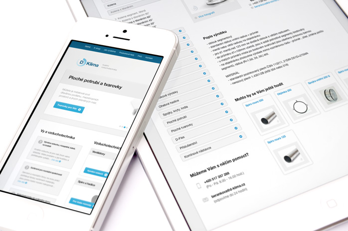 D-Klima - corporate website and e-shop
I gradually provided
- Consultation and analysis
- Logo
- Printed materials
- Corporate website
- E-shop design
Summary
I'm happy, that I managed to imprint the feeling of the fresh air and comfortable climate, in D-Klima's new logo.