Gardenmat
Project timeline
2008
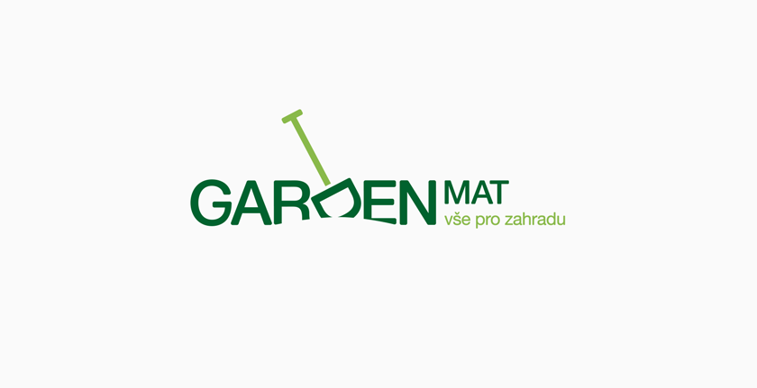
 Gardenmat - basic logo appearance
About client
The core of Gardenmat's business is mostly assembling fences, garden irrigation systems and turnkey landscaping. After years of hard work and hundreds of successfully completed projects, the company deserved and needed a new logo and website.
The brief
The owner, Mr. Matias, assembled a fence and irrigation on my own garden, as well, so I can say that he is a true expert and that's why he deserves a smart logo.
At first sight, the logo catches attention with the symbol of spade, which I created by rotating the letter “D” in the company's name. The negative space in bottom part of the logo is defined by a simple line representing the soil. Nowadays, client uses the logo on his website, printed materials and company vehicles. He gets positive response to it.
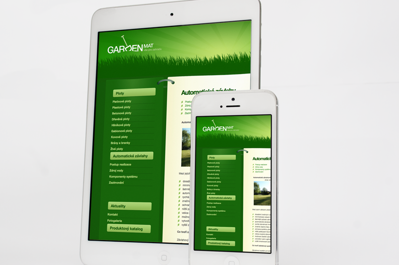
 Gardenmat - website
 Gardenmat - logo on printed CD cover
I gradually provided
- Consultation and analysis
- Logo
- Website
Summary
I respected the nature where nothing is rectangular or aligned. I think that I managed to add a natural character to the logo and pointed out client's specialization.